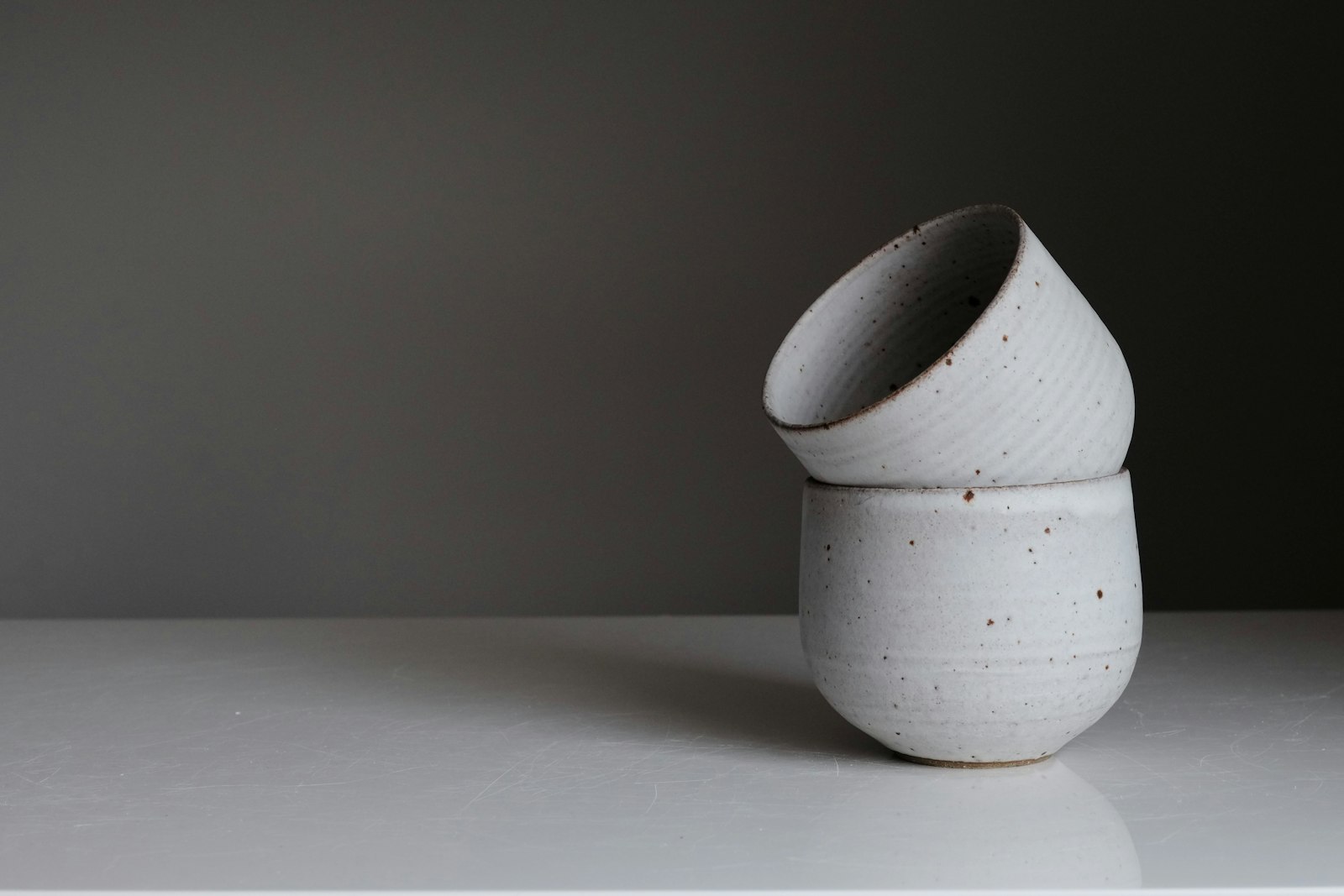
Product detailPro
A product page with a swipeable gallery, finish and size variants, add to bag that confirms in place, shipping, a reviews summary, and details.
- Product pages with a few variants, a gallery, and reviews.
- Stores that want stock aware variants with a restock alert instead of a dead button.
- Products built from many options with live pricing; use product-configurator.
- Browsing many products; use product-listing.
Installation
Install animui once, then import any component or block from its typed package entry.
React 19 and React DOM 19 are required. The package includes Free and Pro entries, styles and TypeScript declarations.
npm install https://animui.stracture.net/__local/package.tgzLoad the stylesheet once at your app root, then use the typed component import:
import 'animui/styles.css';
import { ProductDetail } from 'animui/product-detail';
Read the Code tab for the implementation files and the API reference below for required props.
Download animui 0.3.0 · Agent guideUsage
Use this as the product page of a store. Pass the product with its finishes, sizes and stock, return your cart request from onAddToCart, and send back in stock alerts through onNotify.
import { ProductDetail } from "animui/product-detail"; export function ProductPage({ product }) { return ( <ProductDetail product={product} onAddToCart={selection => fetch("/api/cart", { method: "POST", body: JSON.stringify(selection) })} onNotify={selection => subscribeRestock(selection)} /> );}API reference
2 parts. The first is the root.
ProductDetail
A product page with a swipeable gallery and thumbnails, finish and size variants, a quantity stepper, add to bag that confirms in place, shipping promises, a reviews summary, and a details accordion.
productDetailProductsample lampThe product with finishes, sizes, reviews, shipping lines, and detail sections.defaultFinishstringfirst finishInitial finish id.defaultSizestringfirst sizeInitial size id.onAddToCart(selection: DetailSelection) => void | Promise<void>–Adds the selection. Return a promise to show Adding until it settles; a rejection shows Try again. Without it the preview simulates a short request.onNotify(selection) => void–Called when someone asks to be told when a sold out finish and size is back.onWishlistChange(saved: boolean) => void–Called when the heart is toggled.defaultCartCountnumber0Items already in the bag.maxQuantitynumber9Upper bound of the stepper.currency, localestring"USD", "en-US"Price formatting.classNamestring–Extra class on the root.DetailProduct
id, name, collection, summaryRequiredstring–Identity, breadcrumb collection, and a one or two sentence summary.finishesRequired{ id, name, swatch, images }[]–Each finish has its own photos; switching finish crossfades the gallery in place.sizesRequired{ id, name, price, note?, soldOutIn? }[]–Price per size. soldOutIn lists finish ids in which the size is out of stock.rating, reviewCount, distributionRequirednumber, number, [5 numbers]–Average, total, and counts for 5 to 1 stars.shippingRequired{ title, text }[]–Delivery, returns, and warranty lines.sectionsRequired{ id, title, body }[]–Accordion sections. The first opens by default.- Arrow leftorArrow right
- On the gallery, show the previous or next photo. In the finish and size groups, move the selection.
- Tab
- Move from the gallery to thumbnails, variants, the stepper, add to bag, and the accordion.
- EnterorSpace
- Choose a thumbnail, toggle an accordion section, or add to bag.
- The gallery is a labelled carousel region with slide groups; hidden slides are aria-hidden and the counter is live.
- Finish and size are radiogroups with roving tab stops, like native radios. Sold out sizes stay selectable and say Sold out in text.
- Add to bag reports aria-busy while adding and announces the result; failures show Try again on the button itself.
- Accordion buttons sit in headings with aria-expanded and aria-controls.
- Review bars are hidden from assistive technology and each row carries a text label with its count.
- The gallery follows the pointer 1:1, rubber-bands at the ends, projects the flick with momentum, and hands the release velocity to the spring.
- Changing finish crossfades each photo in place; the thumbnail ring slides between thumbnails.
- The price rolls when size changes. Add to bag morphs through Adding and Added to bag without changing width while the bag icon tilts and its count rolls.
- Review bars fill once when they scroll into view; accordion sections open on a critically damped height spring.
- Reduced motion jumps the gallery, removes travel and blur, and shows final bar widths.
- Above 980px the gallery sticks beside the info column; from 680px to 980px both columns share the width equally.
- Below 680px everything stacks: a square gallery with a four up thumbnail row, then the info.
- Under 420px the reviews summary stacks above the bars. Gallery arrows appear on hover only; touch uses swipe.
- The gallery drags one track with a motion value; only transform changes during a swipe.
- The first photo uses priority loading; the rest load lazily at the gallery's size.
Notes for AI
Give your coding assistant the Markdown reference instead of screenshots.
- Use as the main product page. Put finish specific photos on each finish so the gallery always matches the chosen swatch.
- Return your cart request from onAddToCart so the button shows real pending and error states.
- Keep sections to three or four; long policies belong on their own page.
The full library index for assistants is at /llms.txt.